After a user signs in to the admin console, the first landing page is the Dashboard. The Dashboard provides a snapshot of key metrics in a single view using label cards and graph tiles, such as users, groups, devices, applications, enrollment status, and compliance.
What the Dashboard shows
Counts of users, groups, devices, applications, kiosks, app packages, and policies.
Enrollment information, including enrollment trend and enrollment status (ready for enrollment, enrolled, in progress).
Device-related details such as ownership (corporate/BYOD), device type, manufacturer, device status (online/offline), and risk profile.
Application metrics, including total applications and breakdown by app type.

Customizing the Dashboard
The appearance of the Dashboard can be customized using the Manage widget option in the top-right corner. You can show or hide specific graphs by selecting or clearing the corresponding graph names in the widget list.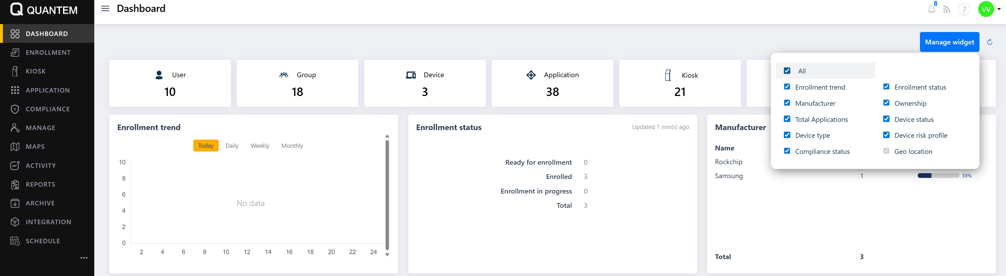
Zooming in on a graph
Each graph tile on the Dashboard has icons in its top-right corner. Clicking the zoom-in icon opens the selected graph in a larger popup window, making it easier to view detailed trends and values.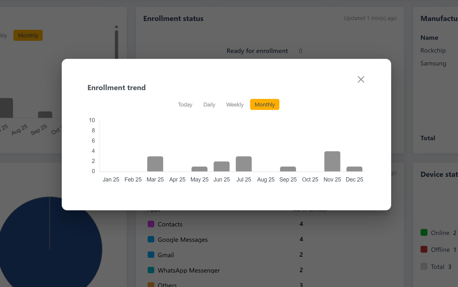
Changing graph order
The order of the graphs on the Dashboard can be rearranged. You can reposition tiles by dragging and dropping them to the desired location so that the most important metrics appear first.
Was this article helpful?
That’s Great!
Thank you for your feedback
Sorry! We couldn't be helpful
Thank you for your feedback
Feedback sent
We appreciate your effort and will try to fix the article